Hop Baron
Brand Identity & Packaging
Brand Identity & Packaging
Hop Baron is a Christchurch craft brewery in the rapidly growing New Zealand craft beer market. I was approached by the three partners to help clarify their initial branding into one that could grow with their business.
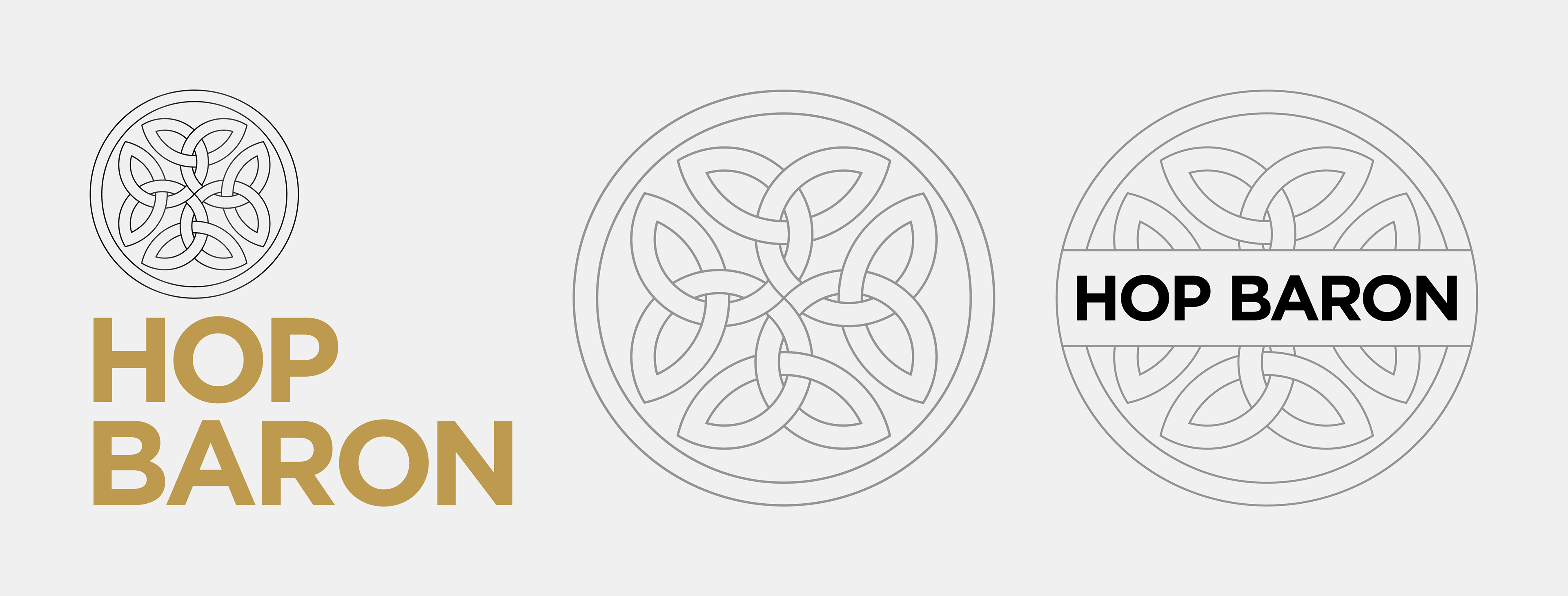
Supplied with a celtic knot and some interesting typography choices, I went about cleaning up the look—using Gotham as the brand typeface and re-working the knot to provide a clean basis to extend the branding across multiple outcomes.
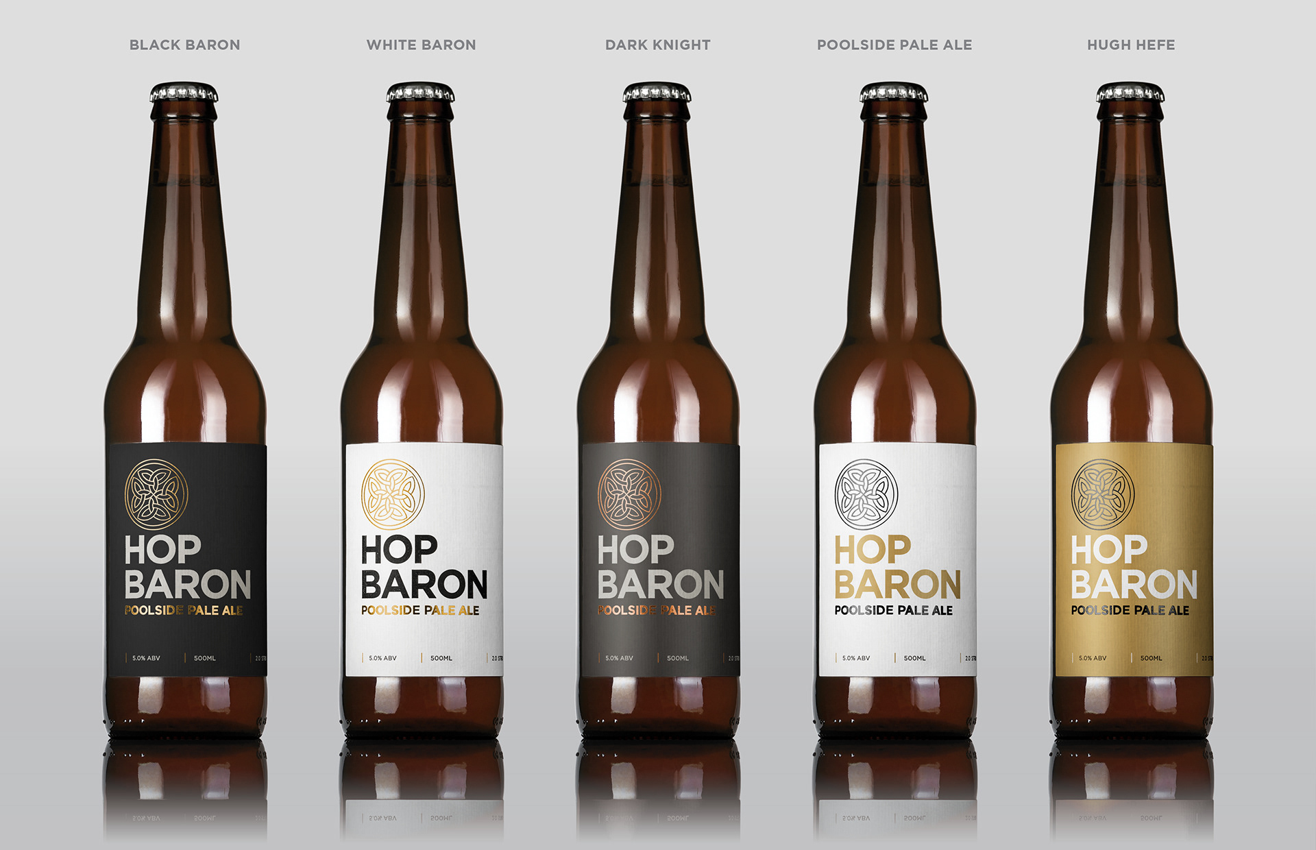
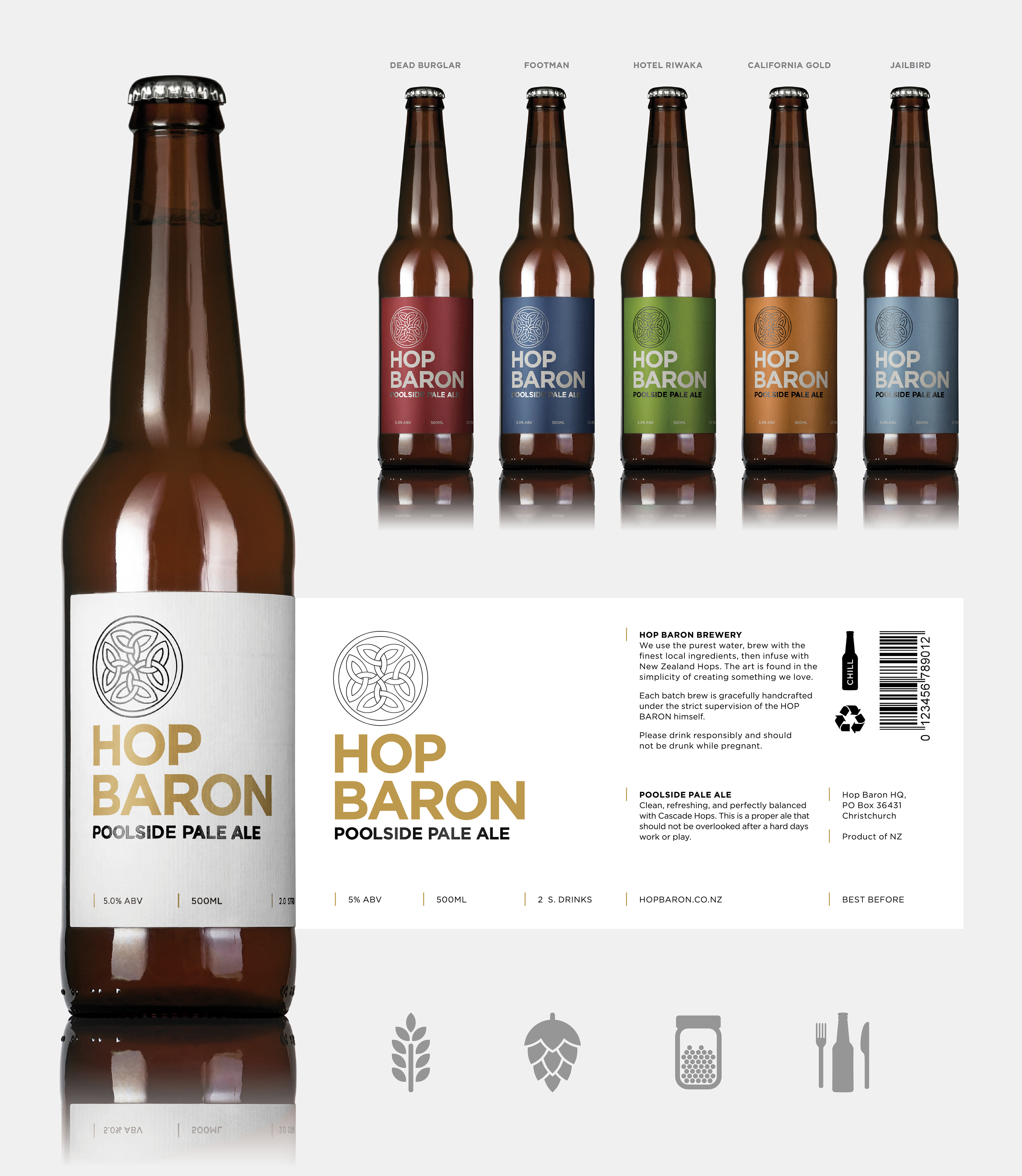
Initially my brief was for the logo and label for their first beer, the ‘Poolside Pale Ale.’ This label would be the benchmark for all other beers to come, so a clean and clear grid system was designed with future beers kept in mind.
The use of a clean grid, uncoated/textured stock, and foiling gave the brand a certain elite class differentiating Hop Baron from the gestural designs that dominated other craft beer labels in the market.
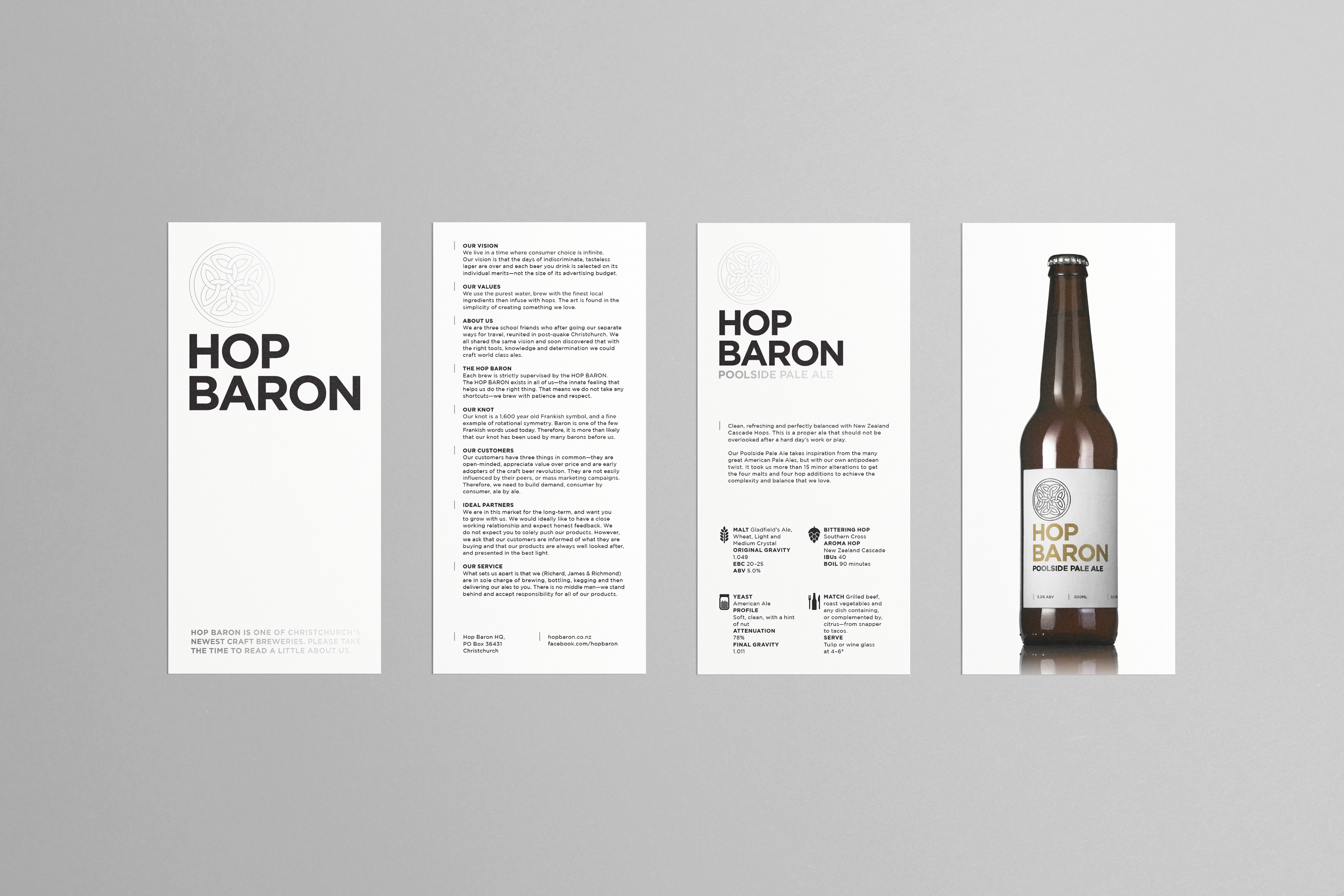
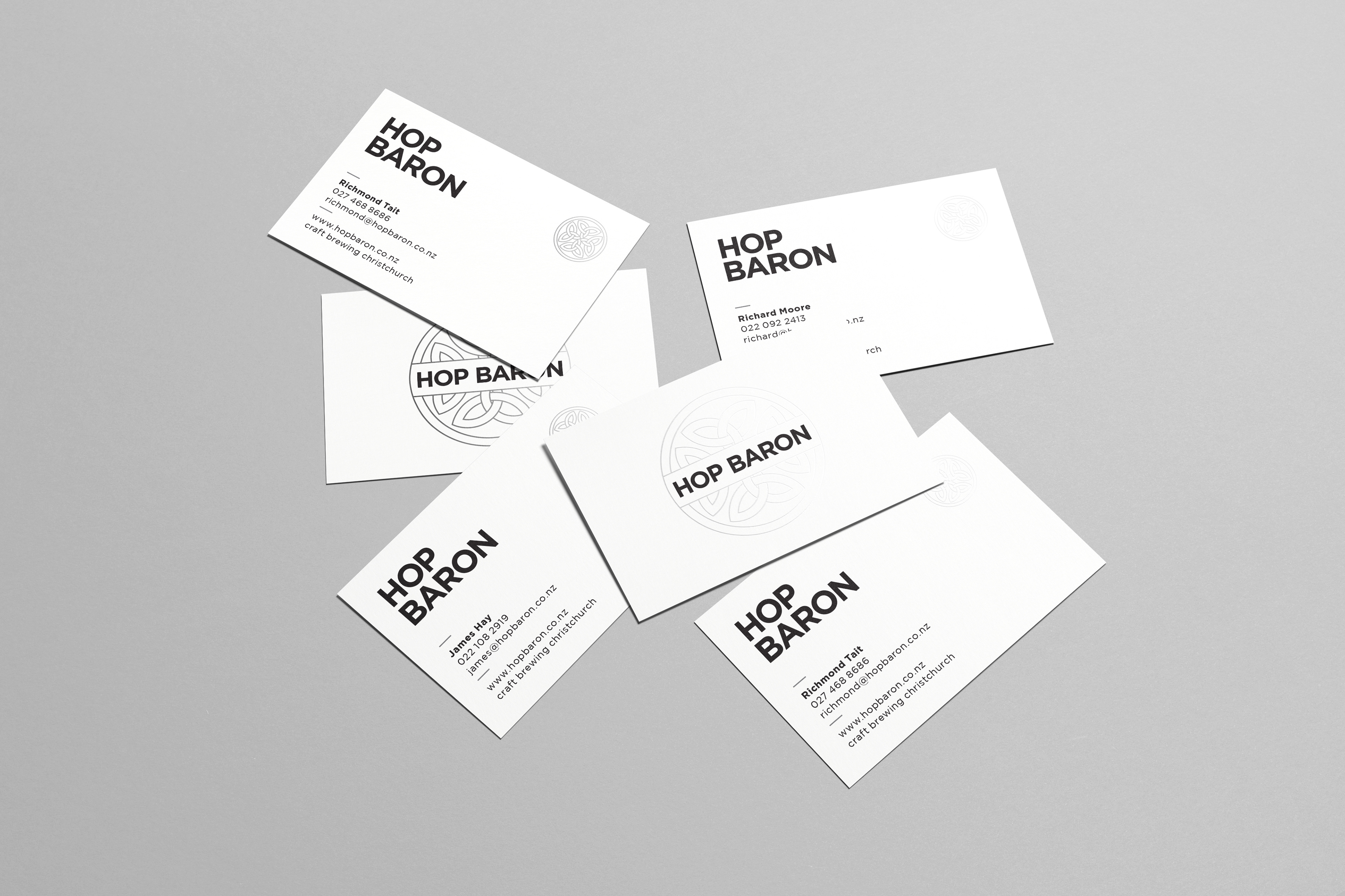
Marketing collateral and stationary were rolled out and concepts for the future beers were mocked up using the Poolside imagery I shot for the DLE promotional flyer. The concept was to use metallic inks and interchange the background colours and complementary foil colours to emulate the style of each beer.